
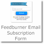
Ribbon: Feedburner Email Subscription box for Blogger/Wordpress
Preview-

Live demo-
Codes for copy-
<style>/*crawlist.net CSS starts*/
.ks-ooo {position:relative; z-index:0;}
.ks-ooo > div {margin-bottom:40px;}
.ks-ooo > div:last-of-type {margin-bottom:0;}
.ks-ooo .ribbon {
margin:auto;
position:relative;
width:300px;
height:40px;
behavior:url(PIE.htc);
}
.ks-ooo .ribbon > span {
display:block;
position:relative;
height:100%;
behavior:url(PIE.htc);
-pie-watch-ancestors:1;
}
.ks-ooo .ribbon > span:before, .ks-ooo .ribbon > span:after {
content:'';
position:absolute;
z-index:-1;
border-style:solid;
border-width:14px;
border-color:transparent;
}
.ks-ooo.ie8 .ribbon > span:before, .ie8 .ribbon > span:after {
display:none;
}
.ks-ooo .ribbon > span:before {
left:-14px;
}
.ks-ooo .ribbon > span:after {
right:-14px;
}
.ks-ooo .ribbon:before {
content:'';
position:absolute;
z-index:-2;
left:-31px;
border-style:solid;
border-width:20px;
border-right-width:25px;
}
.ks-ooo .ribbon:after {
content:'';
position:absolute;
z-index:-2;
right:-31px;
border-style:solid;
border-width:20px;
border-left-width:25px;
}
.ks-ooo .oo1 > span {
-moz-box-shadow: 0 1px 2px rgba(0, 0, 0, 0.5);
-webkit-box-shadow:0 1px 2px rgba(0, 0, 0, 0.5);
box-shadow: 0 1px 2px rgba(0, 0, 0, 0.5);
}
.ks-ooo .oo1 > span:before, .ks-ooo .oo1 > span:after {
bottom:-14px;
}
.ks-ooo .oo1:before {
top:14px;
}
.ks-ooo .oo1:after {
top:14px;
}
.ks-ooo .o1o, .ks-ooo.ie8 .o1o > span {
background-color:#42a5d4;
background-image:-webkit-gradient(linear, left top, left bottom, from(#42a5d4), to(#24769d)); /* Saf4+, Chrome */
background-image:-webkit-linear-gradient(top, #42a5d4, #24769d); /* Chrome 10+, Saf5.1+, iOS 5+ */
background-image: -moz-linear-gradient(top, #42a5d4, #24769d); /* FF3.6 */
background-image: -ms-linear-gradient(top, #42a5d4, #24769d); /* IE10 */
background-image: -o-linear-gradient(top, #42a5d4, #24769d); /* Opera 11.10+ */
background-image: linear-gradient(top, #42a5d4, #24769d);
-pie-background: linear-gradient(top, #42a5d4, #24769d); /* IE6-IE9 */
}
.ks-ooo .o1o > span:before {
border-right-color:#174c66;
}
.ks-ooo .o1o > span:after {
border-left-color:#174c66;
}
.ks-ooo .o1o:before {
border-color:#24769d #24769d #24769d transparent;
}
.ks-ooo .o1o:after {
border-color:#24769d transparent #24769d #24769d;
}
.ks-boxsa {height:135px; width:270px; border:#ccc solid 1px; margin:auto; border-radius:0px 0px 5px 5px;
background:url(http://2.bp.blogspot.com/-C8BJupdefc0/U8JXxDzEyYI/AAAAAAAAEe4/8yFSBFNNMRY/s1600/paper.png);margin-left:14px;
}
.ks-box {height:150px; width:300px;}
.ks-box h4{font-size:16px; text-align:center;
color:#fff;
line-height:40px;
font: Georgia;
font-weight:200;
font-style:italic;
}
#ks-inject { background: url('http://1.bp.blogspot.com/-CdoXCXa27vc/U9D125NlYLI/AAAAAAAAEp8/sBDcoTCLSYo/s1600/email.png') #fff no-repeat 10px center; padding-left: 35px;
border: 1px solid #ccc;
font-size: 15px;
line-height:2;
height:37px;
width:198px;
border-radius: 3.5px;
-moz-border-radius: 3.5px;
-webkit-border-radius: 3.5px;
box-shadow: 0 2px 2px #ddd;
-moz-box-shadow: 0 2px 2px #ddd;
-webkit-box-shadow: 0 2px 2px #ddd;
margin-top:13.5px;
-webkit-transition: all 1s ease;
-moz-transition: all 1s ease;
-o-transition: all 1s ease;
-ms-transition: all 1s ease;
transition: all 1s ease;}
#ks-inject:focus { border-color:#F4836A;
outline: none;
box-shadow: 0 0 2px 1px #F4836A;
-webkit-transition: all 1s ease;
-moz-transition: all 1s ease;
-o-transition: all 1s ease;
-ms-transition: all 1s ease;
transition: all 1s ease;}
#ks-buofo {
position: relative;
vertical-align: top;
width: 165px;
height: 40px;
padding: 0;
font-size: 24px;
color: white;
text-align: center;
text-shadow: 0 1px 2px rgba(0, 0, 0, 0.25);
background: #3498db;
border: 0;
border-bottom: 2px solid #2a8bcc;
cursor: pointer;
-webkit-box-shadow: inset 0 -2px #2a8bcc;
box-shadow: inset 0 -2px #2a8bcc;
margin-top:10.5px;
border-radius: 1.5px;
-moz-border-radius: 1.5px;
-webkit-border-radius: 1.5px;
}
#ks-buofo:hover {opacity:0.7;}
#ks-buofo:active {
top: 1px;
outline: none;
-webkit-box-shadow: none;
box-shadow: none;
}
.ks-boxsa h6{font: "Segoe UI"; font-size:14px; font-weight:100; margin-top:7px; color:#333; font-style:italic;
}
/*crawlist.net CSS ends*/
</style>
<!--crawlist.net widget starts-->
<div class="ks-box">
<div class="ks-ooo">
<div class="ribbon oo1 o1o"><span><h4>Subscribe for Newsletter</h4></span></div>
<div class="ks-boxsa" align="center">
<form action='http://feedburner.google.com/fb/a/mailverify' method='post' onsubmit='window.open('http://feedburner.google.com/fb/a/mailverify?uri=FeedId', 'popupwindow', 'scrollbars=yes,width=550,height=500');return true' target='popupwindow'>
<input name='uri' type='hidden' value='crawlist'/>
<input name='loc' type='hidden' value='en_US'/>
<input id='ks-inject' name='email' onblur='if (this.value == "") {this.value = "Enter your email";}' onfocus='if (this.value == "Enter your email") {this.value = ""}' type='text' value='Enter your email'/>
<input id='ks-buofo' title='' type='submit' value='Submit'/>
</form>
<h6 align="center"><img src="http://4.bp.blogspot.com/-u0LjE0mzObA/U9D12x8PD4I/AAAAAAAAEqA/qdJKnbFgnTY/s1600/lock.png" height="12px" width="10px"/> 100% Privacy Guaranty</h6>
</div></div></div>
<!--crawlist.net widget ends-->
How to add this widget in Blogger
- First log in to your Blogger, select your Blog,
- Go to 'Layout' tab then click 'add a gadget'
- Select 'html/javascript' from pop up menu.
- Copy following codes and configure
How to add this widget in Wordpress
- From dashboard hover mouse on appearance tab,
- From appearance menu select 'widgets',
- Then drag and drop 'Text' content box in widget area,
- Copy following codes and paste into 'text' box,
- For new dashboard click on 'Text' add it to sidebar and paste following codes and configure
How to configure
First log into your Feedburner account, get your Feedburner Id and replace FeedId pink colored (example- http://feeds.feedburner.com/your website’s feed id) Then save widget. Visit your site to see this widget working.
Widget compatibility
- This widget tested with many templates and it compatible with all of them. Some template will not show this widget properly, in that case you have to fix widget’s margin code.
- This widget works fine on All major web browser (latest versions)


