Add Swing effect on Images of Blogger blog

Add Swing effect on Images of Blogger blog
CSS3 took web design to its most wanted attractive step. Using CSS3 effects on websites elements (text, images) makes our site look gorgeous and trendy. With this site I try to publish various CSS3 effects (base Button, Image effect) what you can use on your web project and Blogger blogs easily. To continue that here another super cool effect I presenting. It will give your image Swing effect on mouse hover. Made with CSS3 transform animation and keyframes to design the swinging pattern, it also cross browser supports. Let’s see how it looks like and how to enable it on your image of Blogger.

Add CSS3 Swing effect on Images of Blogger blog


Live demo-


Codes for copy-

Part 1: CSS


/*crawlist.net css starts*/
.ks-swing:hover{
    -webkit-animation:swinging 10s ease-in-out 0s infinite;
    -moz-animation:swinging 10s ease-in-out 0s infinite;
    animation:swinging 10s ease-in-out 0s infinite;   
    -webkit-transform-origin:50% 0;
    -moz-transform-origin:50% 0;
    transform-origin:50% 0;
}

@-webkit-keyframes swinging{
    0% { -webkit-transform: rotate(0); }
    5% { -webkit-transform: rotate(10deg); }
    10% { -webkit-transform: rotate(-9deg); }
    15% { -webkit-transform: rotate(8deg); }
    20% { -webkit-transform: rotate(-7deg); }
    25% { -webkit-transform: rotate(6deg); }
    30% { -webkit-transform: rotate(-5deg); }
    35% { -webkit-transform: rotate(4deg); }
    40% { -webkit-transform: rotate(-3deg); }
    45% { -webkit-transform: rotate(2deg); }
    50% { -webkit-transform: rotate(0); }
    100% { -webkit-transform: rotate(0); }
}

@-moz-keyframes swinging{
    0% { -moz-transform: rotate(0); }
    5% { -moz-transform: rotate(10deg); }
    10% { -moz-transform: rotate(-9deg); }
    15% { -moz-transform: rotate(8deg); }
    20% { -moz-transform: rotate(-7deg); }
    25% { -moz-transform: rotate(6deg); }
    30% { -moz-transform: rotate(-5deg); }
    35% { -moz-transform: rotate(4deg); }
    40% { -moz-transform: rotate(-3deg); }
    45% { -moz-transform: rotate(2deg); }
    50% { -moz-transform: rotate(0); }
    100% { -moz-transform: rotate(0); }
}

@keyframes swinging{
    0% { transform: rotate(0); }
    5% { transform: rotate(10deg); }
    10% { transform: rotate(-9deg); }
    15% { transform: rotate(8deg); }
    20% { transform: rotate(-7deg); }
    25% { transform: rotate(6deg); }
    30% { transform: rotate(-5deg); }
    35% { transform: rotate(4deg); }
    40% { transform: rotate(-3deg); }
    45% { transform: rotate(2deg); }
    50% { transform: rotate(0); }
    100% { transform: rotate(0); }
}
/*crawlist.net css ends*/


Part 2: HTML

<img class="ks-swing" src="Image Link"/>

How to add this effect on Blogger

Step 1:
  • Log in to your Blogger, select your blog
  • Go to ‘template’ tab
  • Select ‘Edit HTML’
  • Find into codes snippet (Using Ctrl+f or Cmd+f) ]]><
  • Above ]]>< copy and paste Part 1’s codes
  • Save template

Step 2:
  • While you writing a post, After upload and insert complete for a image, Select ‘HTML’ view from (compost/html) upper side of post editor.
  • You will see your uploaded images source code, Place
class="ks-swing"

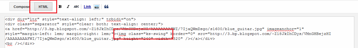
in the <img tag. See the picture for more info about how to do it.
css3 swing effect
  • After placing the Class, back to ‘compose’ view
Your image swinging is done,

How to use this effect on web project
  • Copy and paste the CSS part into your web project’s stylesheet.css
  • And call your image with part 2’s HTML part where you want to show this effect
So what you think about this CSS3 tutorial for Blogger, don’t forget to mention. New tutorial will be release soon, stay connected. Chill…

Animated 'Advertise Here' widget for Blogger

Animated 'Advertise Here' widget for Blogger
If your blogsite receive a good amount of visitor, for your profit you can host 'advertise here' campaigns on your site. For creating ‘advertise here’ campaigns you will need widget space of 125x125 on widget area, a image/text what contains your offer and contact page’s hyperlink. For making you job easy here I developed a simple, fresh and trendy ‘Advertise here’ widget. It got flat colored images (10 colors), CSS3 transition effects and it’s very easy to configure. Let’s take a look at this widget, and how to add and configure.

Animated 'Advertise Here' widget for Blogger


Preview-
Animated advertise here widget for Blogger

Live Demo- (Click here)

Codes for copy-

<style>
/*crawlist.net CSS starts*/
.ks-adver {
    list-style: none;
    padding:0;
    width:300px;
}
.ks-adver li {
    display: inline-block;
    margin: 3px 3px 3px 3px;
    vertical-align: top;
}
.ks-adver li > a,
.ks-adver li > a img {
    width:125px;
    border: none;
    outline: none;
    display: block;
    position: relative;
    transition: all 0.7s ease-in-out;
    -moz-transition: all 0.7s ease-in-out;
    -webkit-transition: all 0.7s ease-in-out;
    -o-transition: all 0.7s ease-in-out;
}
.ks-adver li > a img:hover {
    border-radius:50%;
    z-index: 9999;
    opacity:.7;
}
/*crawlist.net CSS ends*/
</style>

<!--crawlist.net widget starts-->
<ul class="ks-adver">
<li>
<a href="contact page link" target="_blank"><img src="http://2.bp.blogspot.com/-7FMGsNk1ZMo/VLuMWnmupKI/AAAAAAAAFSo/W4UPsyu_KYM/s1600/blue.png"/></a>
</li>
<li>
<a href="contact page link" target="_blank"><img src="http://3.bp.blogspot.com/-vvrnP2yztGc/VLuMWsDvTaI/AAAAAAAAFS0/x1DfQOCFrvU/s1600/gray.png"/></a>
</li>
<li>
<a href="contact page link" target="_blank"><img src="http://3.bp.blogspot.com/-s65RzJkWSao/VLuMW5ZZ9LI/AAAAAAAAFSs/JAPeTGiXdjs/s1600/green.png"/></a>
</li>
<li>
<a href="contact page link" target="_blank"><img src="http://4.bp.blogspot.com/-XJQbKpY4rkE/VLuMYrRf8hI/AAAAAAAAFTA/mK-021-luPk/s1600/nevy.png"/></a>
</li>
<li>
<a href="contact page link" target="_blank"><img src="http://2.bp.blogspot.com/-yDhbRWm8oUY/VLuMYhTTGnI/AAAAAAAAFTE/Se2QmAK3jMo/s1600/orange.png"/></a>
</li>
<li>
<a href="contact page link" target="_blank"><img src="http://4.bp.blogspot.com/-tWoPzXF1ry0/VLuMZDUZ3wI/AAAAAAAAFTI/0b8ZdgMwwso/s1600/purple.png
"/></a>
</li>
<li>
<a href="contact page link" target="_blank"><img src="http://1.bp.blogspot.com/-MLxOsJmzefM/VLuMZxmLq0I/AAAAAAAAFTU/om7-md91wUw/s1600/red.png"/></a>
</li>
<li>
<a href="contact page link" target="_blank"><img src="http://2.bp.blogspot.com/-rhnpoK2pgmw/VLuMb2B-SyI/AAAAAAAAFTk/V-IdzbmY4kA/s1600/sky.png"/></a>
</li>
<li>
<a href="contact page link" target="_blank"><img src="http://2.bp.blogspot.com/-w_QLt9-Pb8Q/VLuMbg5g8tI/AAAAAAAAFTg/TAy35y8MS3s/s1600/teal.png"/></a>
</li>
<li>
<a href="contact page link" target="_blank"><img src="http://3.bp.blogspot.com/-ohxWOR-STK4/VLuMdFTuKtI/AAAAAAAAFTw/_kEWRY2Is44/s1600/yallow.png"/></a>
</li>
</ul>
<!--crawlist.net widget ends-->


How to add-
  • First log in to your Blogger, select your Blog,
  • Go to 'Layout' tab then click 'add a gadget’ 
  • Select 'html/javascript' from pop up menu. 
  • Copy following codes and configure.

How to configure-
  • I made 10 kind of label, but you maybe will use 2 or 4. So remove what color you don’t want to use. Example- If you don’t want to use Blue one, just remove this line from whole codes. 
<li>
<a href="contact page link" target="_blank"><img src="http://2.bp.blogspot.com/-7FMGsNk1ZMo/VLuMWnmupKI/AAAAAAAAFSo/W4UPsyu_KYM/s1600/blue.png"/></a>
</li>
  • In ‘contact page link’ replace your contact page address starts with http://
  • Save gadget, and check out your Blogger blog for see this widget working.
So what you think about this widget don’t’ forget to mention, New widget will be release soon so stay subscribed…

11 Best Free Domain register sites to know about

11 Best Free Domain register sites to know about
Usually domain name sells starts from 8-10 dollars, but if you don’t want to expend money for domain name and you looking for it seriously you can get/register a lot’s of domain name freely. These free domains is not actually (com, net or org) domains but works just like them. Free domains are part of a big domain name and allow you to use its sub-domains, some case free domains offers full DNS service (like- Name server, Mx-Cname-A-Sos records, URL redirection, webmail etc). Here for your consideration I gathered the names of top free domain register services. Read on and get some ;)

11 Best Free Domain register sites to know about

  • It’s the one of the biggest, oldest and best free domain register service, millions of customer
  • Tk domains are as powerful as paid domains.
  • You can register as many you want.
  • Tk domains have short extension just .tk
  • If your site does not receive enough visitors per month, your domain will be deleted by term.
 
  • You can register up to 100 domain names for free, or purchase a domain name VIP account and get up to 1000 domain names
  • Two years of domain validity
  • Provides additional free DNS service with full MX, CNAME, A and SOA records
  • Affiliate offers, you can income money by referring
 
  • CO.NR only provides a free domain name that you can forward to your existing website
  • Link back to CO.NR is absolutely required
  • 2 Months inactivity limit
 
  • Register up to 2 domains for Free
  • Simple DNS Configurations Set up custom domain 2 clicks
  • All your DNS changes are instant.
 
  • Free domain with full DNS management (URL forwarding, URL cloaking, Path forwarding for files and directories, statistics, access control)
  • Unlimited emails (with mailbox, POP3, IMAP, storage, Anti-Virus- und Anti-SPAM, calendar and contact management)
  •  Free hosting (300mb Webspace, unlimited traffic, unlimited bandwidth, fast high-performance servers, FTP, MySQL, PHP5)
  • A lot of extension available
 
  • Free domain with full DNS management (URL forwarding, URL cloaking, Path forwarding for files and directories, statistics, access control)
  • Unlimited emails (with mailbox, POP3, IMAP, storage, Anti-Virus- und Anti-SPAM, calendar and contact management)
  • Free hosting (300mb Webspace, unlimited traffic, unlimited bandwidth, fast high-performance servers, FTP, MySQL, PHP5)
  • A lot of extension available
 
  • Full DNS management (Instant activation, URL forwarding, URL cloaking, Path forwarding for files and directories, statistics, access control)
  • Unlimited email (with POP3, IMAP, E-Mail-Weiterleitung, Catch-All, Alias, Auto Responder, Webmail, Anti-Virus- und Anti-SPAM, calendar and contact management)
  • Free hosting (with 300mb Webspace, unlimited traffic, unlimited bandwidth, fast high-performance servers, FTP, MySQL, PHP5)
 
  • Free domain with full DNS management (URL forwarding, URL cloaking, Path forwarding for files and directories, statistics, access control)
  • Unlimited emails (with mailbox, POP3, IMAP, 1gb mail storage, Anti-Virus- und Anti-SPAM, calendar and contact management)
  • Free hosting (300mb Webspace, unlimited traffic, unlimited bandwidth, fast high-performance servers, FTP, MySQL, PHP5)
  • A lot of extension available
 
  • Free domain with full DNS management (URL forwarding, URL cloaking, Path forwarding for files and directories, statistics, access control)
  • Unlimited emails (with mailbox, POP3, IMAP, storage, Anti-Virus- und Anti-SPAM, calendar and contact management)
  • Free hosting (300mb Webspace, unlimited traffic, unlimited bandwidth, fast high-performance servers, FTP, MySQL, PHP5)
  • A lot of extension available
 
  • Free domain with full DNS management (URL forwarding, URL cloaking, Path forwarding for files and directories, statistics, access control)
  • Unlimited emails (with mailbox, POP3, IMAP, storage, Anti-Virus- und Anti-SPAM, calendar and contact management)
  • Free hosting (300mb Webspace, unlimited traffic, unlimited bandwidth, fast high-performance servers, FTP, MySQL, PHP5)
 
  • Link back to Com Co In is absolutely required
  • Full DNS management (Instant Activation, Choice of Domain, URL Cloaking/Masking, Path Forwarding, Optional WWW Prefix, Traffic Statistics, Meta Tags, Control Panel, Fast Activation)
  • Unlimited domain redirection
 
And, Almost every Free hosting provider offers sub domain base unlimited free domains. Here top 30 free hosting providers listed, sign up with any site and get free domains. So what your opinion about using free domain and which service you going to use don’t forget to mention.

How to embed Vimeo video in Blogger

How to embed Vimeo video in Blogger
Vimeo is a very popular video sharing platform like YouTube. Vimeo receive more than 100 million unique visitors per month and with register an account it allows you to upload, share, view and download videos. Apart from these services Vimeo also allow to embed Vimeo video on your site. If you uploaded videos on your Vimeo account or want to show somebody’s video from Vimeo on your Blogger site, keep on reading. This tutorial will show you how to embed Vimeo video on your Blogger blog.

How to embed Vimeo video in Blogger


There is three ways you can show your Vimeo video.

1. As single video frame, allows you to embed one specific video

2. Hubnut, enables you to show multiple videos consecutively, so people can keep watching your channel

3. Montage, Create a visual display of your latest videos. Choose the number of videos and the layout

All processes are described below respectively:-

1. As single video frame
  • Go to a video’s playing page (which video you intent to embed), 
  1. From right side of the player click on ‘Share’ button, 
  • Select </> to see embed code, from next window select ‘Copy’

How to embed Vimeo video in Blogger

  • You may change default ‘Height’ and ‘Width’
  • How to embed
  • From post editor's top (Compose/Html) select 'HTML', 
  • After clicking 'Html' paste configured following code, and get back to ‘Compose’ part.

2. Hubnut, create a Hubnut widget
  • Click here to go widget builder, log in to your Vimeo account
  • Customize Your Hubnut:
  • Choose a video stream among choice of (Your subscriptions, Channel, Group, Album, portfolio)
  • Set Slideshow, Title, Byline, colors
  • Copy the codes and embed
  • From post editor's top (Compose/Html) select 'HTML', 
  • After clicking 'Html' paste configured following code, 
  • And get back to ‘Compose’ part

3. Montage, create a Montage widget
  • Click here to go widget builder, log in to your Vimeo account
  • Customize Your Montage widget, And Copy the codes and embed

Vimeo is a new trend of playing video on your site; its player frame is more beautiful than YouTube’s frame (HTML5 and cross browser supported), quickly add to favorite, watch later option. So embed your Vimeo video on your Blogger blog easily, any feedback leave with comment. Goodluck….

How to make Ripple effect using CSS3

How to make Ripple effect using CSS3
CSS3 elements (like transition, transform) help us to create many many super cool effects to enhance our web designing. In my previous posts I published some of cool CSS3 tricks like- Shake, Flash, Opacity, Tilt, Jump, Morph effects what already may be you used in your projects, and here I am publishing another great CSS3 trick what will give you wiggle effect on button/images. It’s done by using ‘transform’ property and designed with keyframes to make effect appear step by step. Let’s see how to make wiggle effect using CSS3.

How to make Ripple effect using CSS3

Live Demo:-


Designing the class 
 
Let's name the class

.ks-wiggle

Within bracket 'border' for image added

Whereas our effect will appear on mouse hover so let’s add :hover with class

.ks-wiggle:hover

Within bracket adding animation name, timing-function and duration with cross browser supported prefixes (for mozilla 'moz', for safari and chorme 'webkit' etc)

-webkit-animation-name: wiggle;
    -moz-animation-name: wiggle;
    -ms-animation-name: wiggle;
    -o-animation-name: wiggle;
    animation-name: wiggle;
    -webkit-animation-timing-function: ease-in;
    -moz-animation-timing-function: ease-in;
    -ms-animation-timing-function: ease-in;
    -o-animation-timing-function: ease-in;
    animation-timing-function: ease-in;
    -webkit-animation-duration: 1s;
    -moz-animation-duration: 1s;
    -ms-animation-duration: 1s;
    -o-animation-duration: 1s;
    animation-duration: 1s;

And then call keyframes to create ‘transform’ animation and (0% to 100%) for distribute animation’s function. Also added cross browser supported prefixes

@keyframes wiggle {
    0% { transform: skewX(9deg); }
    10% { transform: skewX(-8deg); }
    20% { transform: skewX(7deg); }
    30% { transform: skewX(-6deg); }
    40% { transform: skewX(5deg); }
    50% { transform: skewX(-4deg); }
    60% { transform: skewX(3deg); }
    70% { transform: skewX(-2deg); }
    80% { transform: skewX(1deg); }
    90% { transform: skewX(0deg); }
    100% { transform: skewX(0deg); }
}


Now whole CSS looking like:-

/*crawlist.net wiggle starts*/
.ks-wiggle {
  border:2px #333 solid; 
  cursor: pointer; 
 }

.ks-wiggle:hover  {
    -webkit-animation-name: wiggle;
    -moz-animation-name: wiggle;
    -ms-animation-name: wiggle;
    -o-animation-name: wiggle;
    animation-name: wiggle;
    -webkit-animation-timing-function: ease-in;
    -moz-animation-timing-function: ease-in;
    -ms-animation-timing-function: ease-in;
    -o-animation-timing-function: ease-in;
    animation-timing-function: ease-in;
    -webkit-animation-duration: 1s;
    -moz-animation-duration: 1s;
    -ms-animation-duration: 1s;
    -o-animation-duration: 1s;
    animation-duration: 1s;
}
@-webkit-keyframes wiggle {
    0% { -webkit-transform: skewX(9deg); }
    10% { -webkit-transform: skewX(-8deg); }
    20% { -webkit-transform: skewX(7deg); }
    30% { -webkit-transform: skewX(-6deg); }
    40% { -webkit-transform: skewX(5deg); }
    50% { -webkit-transform: skewX(-4deg); }
    60% { -webkit-transform: skewX(3deg); }
    70% { -webkit-transform: skewX(-2deg); }
    80% { -webkit-transform: skewX(1deg); }
    90% { -webkit-transform: skewX(0deg); }
    100% { -webkit-transform: skewX(0deg); }
}

@-moz-keyframes wiggle {
    0% { -moz-transform: skewX(9deg); }
    10% { -moz-transform: skewX(-8deg); }
    20% { -moz-transform: skewX(7deg); }
    30% { -moz-transform: skewX(-6deg); }
    40% { -moz-transform: skewX(5deg); }
    50% { -moz-transform: skewX(-4deg); }
    60% { -moz-transform: skewX(3deg); }
    70% { -moz-transform: skewX(-2deg); }
    80% { -moz-transform: skewX(1deg); }
    90% { -moz-transform: skewX(0deg); }
    100% { -moz-transform: skewX(0deg); }
}

@-ms-keyframes wiggle {
    0% { -ms-transform: skewX(9deg); }
    10% { -ms-transform: skewX(-8deg); }
    20% { -ms-transform: skewX(7deg); }
    30% { -ms-transform: skewX(-6deg); }
    40% { -ms-transform: skewX(5deg); }
    50% { -ms-transform: skewX(-4deg); }
    60% { -ms-transform: skewX(3deg); }
    70% { -ms-transform: skewX(-2deg); }
    80% { -ms-transform: skewX(1deg); }
    90% { -ms-transform: skewX(0deg); }
    100% { -ms-transform: skewX(0deg);  }
}

@-o-keyframes wiggle {
    0% { -o-transform: skewX(9deg); }
    10% { -o-transform: skewX(-8deg); }
    20% { -o-transform: skewX(7deg); }
    30% { -o-transform: skewX(-6deg); }
    40% { -o-transform: skewX(5deg); }
    50% { -o-transform: skewX(-4deg); }
    60% { -o-transform: skewX(3deg); }
    70% { -o-transform: skewX(-2deg); }
    80% { -o-transform: skewX(1deg); }
    90% { -o-transform: skewX(0deg); }
    100% { -o-transform: skewX(0deg); }
}

@keyframes wiggle {
    0% { transform: skewX(9deg); }
    10% { transform: skewX(-8deg); }
    20% { transform: skewX(7deg); }
    30% { transform: skewX(-6deg); }
    40% { transform: skewX(5deg); }
    50% { transform: skewX(-4deg); }
    60% { transform: skewX(3deg); }
    70% { transform: skewX(-2deg); }
    80% { transform: skewX(1deg); }
    90% { transform: skewX(0deg); }
    100% { transform: skewX(0deg); }
}
/*crawlist.net wiggle ends*/


Now it's time to call designed wiggle effect ‘class’ with HTML <img> tag, so with a IMG class call it,

<img class="ks-wiggle" src="Your Image Link"/>

Do it by yourself, on Codepen or CSSdeck or Dreamweaver, and use it on your web project. New CSS3 tutorial will be release soon so stay connected ;)

Add Weather widget in Blogger

Add Weather widget in Blogger
Sometime on your website (no matter they are personal blogs or business websites) needs to show your weather situation to visitors. In that case for showing weather to visitors you can use weather services like Accuweather, Weather underground. Collect weather information from those services and use the weather info on your site. Also they offer these weather info as widget. 
  • Which you can easily add on your site,
  • These widget designed to show frequently update of weather,
  • These widgets are Capable of showing weather of visitors,
  • As well as offers satisfiable background and sizes.

Let's see how these weather widget looks like, how to configure and add to your blogger blog.

Add Weather widget in Blogger

Accuweather  
Add weather widget in Blogger
Accuweather offer free and premium weather service all over the world. Accweather weather widget offers:
  • 3 different of widget style
  • 4 different of widget size
  • Dynamic background
  • Current weather conditions
  • Responsive layout fits any size
  • Well suited for mobile websites
  • Choose between Your weather or visitor's location weather

How to get this weather widget

Click here to go Accuweather's widget builder
Then:
  • Select your widget style,
  • Define which location weather to display,
  • Choose the size of widget,
  • Define unit (C/F)

Mark (I agree to the terms and condition) and hit 'Grab the code'

Copy those codes and:
  • Log in to your Blogger, Select your Blog,
  • Go to 'Layout' tab then click 'add a gadget’
  • Select 'html/javascript' from pop up menu. Copy following codes and ‘Save gadget'

Weather underground 
Add weather widget in Blogger

Weather underground is a powerful worldwide weather predict service. Weather underground's widget offers:
  • Wide choice of style
  • Static background
  • Capable of showing both unit (C/F)
  • Shows only your location weather

How to get this weather widget
  • Input your Location (type your location in field)
  • Select the Weather Station Source (Automatic)
  • Define unit preference (C/F/Both)
  • Select a widget and configure as well
  • Click on configured widget and copy the code 
and :-
  • Log in to your Blogger, Select your Blog,
  • Go to 'Layout' tab then click 'add a gadget’
  • Select 'html/javascript' from pop up menu. 
  • Copy following codes and ‘Save gadget'

You may delete this line (If you don't want to give them backlink.)

<a href="http://www.wunderground.com/cgi-bin/findweather/getForecast?query=zmw:94101.1.99999&bannertypeclick=wu_bluestripes" title="Get latest Weather Forecast updates" style="font-family: sans-serif; font-size: 12px" target="_blank">Click for weather forecast</a>

Weather widget is a very useful widget for commercial sites, so choose what kind of weather widget you want to use on your site and add 'em. Goodluck...

How to make Flash/Blinking button with CSS3

How to make Flash/Blinking button with CSS3
You may be familiar with Flash effect button (on hover button starts to blink fast), these flash effect usually made with CSS3 keyframes animation and button constructed with CSS. Here I explained how to create flash effect button with CSS3 keyframes animation, let’s take the journey:-

How to make Flash/Blinking button with CSS3

Preview & Demo:-


Designing the button

Let's name the button with CSS class

.ks-flash

Within bracket fixing 'height' and 'width', additionally 'border-radius' and 'cursor', and as button background using Gradient color.

Designing the button's link

.ks-flash a
Within bracket added 'font-family', 'font-size', 'text-decoration', 'display' etc

And finally designing :hover with CSS3 keyframes

.ks-flash:hover


Within bracket adding animation name and duration with cross browser supported prefixes (for mozilla 'moz', for safari and chorme 'webkit' etc)

     -webkit-animation-name: flash;
    -moz-animation-name: flash;
    -ms-animation-name: flash;
    -o-animation-name: flash;
    animation-name: flash;
    -webkit-animation-duration:1s;
    -moz-animation-duration: 1s;
    -ms-animation-duration: 1s;
    -o-animation-duration: 1s;
    animation-duration: 1s; 


And than call keyframe (at cursor hover's 0%, 50%, 100% the button will be shown and at 25%, 75% button will be despair using 'opacity')

@keyframes flash {
    0%, 50%, 100% {opacity: 1;}   
    25%, 75% {opacity: 0;}
}


and also added cross browser supported prefixes

Now whole CSS looking like:-

/*crawlist.net button starts*/
.ks-flash {
  vertical-align: top;
  width:200px;
  height:50px;
  cursor: pointer; 
 border-radius:3px;
background: #7d7e7d;
background: url(data:image/svg+xml;base64,PD94bWwgdmVyc2lvbj0iMS4wIiA/Pgo8c3ZnIHhtbG5zPSJodHRwOi8vd3d3LnczLm9yZy8yMDAwL3N2ZyIgd2lkdGg9IjEwMCUiIGhlaWdodD0iMTAwJSIgdmlld0JveD0iMCAwIDEgMSIgcHJlc2VydmVBc3BlY3RSYXRpbz0ibm9uZSI+CiAgPGxpbmVhckdyYWRpZW50IGlkPSJncmFkLXVjZ2ctZ2VuZXJhdGVkIiBncmFkaWVudFVuaXRzPSJ1c2VyU3BhY2VPblVzZSIgeDE9IjAlIiB5MT0iMCUiIHgyPSIwJSIgeTI9IjEwMCUiPgogICAgPHN0b3Agb2Zmc2V0PSIwJSIgc3RvcC1jb2xvcj0iIzdkN2U3ZCIgc3RvcC1vcGFjaXR5PSIxIi8+CiAgICA8c3RvcCBvZmZzZXQ9IjEwMCUiIHN0b3AtY29sb3I9IiMwZTBlMGUiIHN0b3Atb3BhY2l0eT0iMSIvPgogIDwvbGluZWFyR3JhZGllbnQ+CiAgPHJlY3QgeD0iMCIgeT0iMCIgd2lkdGg9IjEiIGhlaWdodD0iMSIgZmlsbD0idXJsKCNncmFkLXVjZ2ctZ2VuZXJhdGVkKSIgLz4KPC9zdmc+);
background: -moz-linear-gradient(top, #7d7e7d 0%, #0e0e0e 100%);
background: -webkit-gradient(linear, left top, left bottom, color-stop(0%,#7d7e7d), color-stop(100%,#0e0e0e));
background: -webkit-linear-gradient(top, #7d7e7d 0%,#0e0e0e 100%);
background: -o-linear-gradient(top, #7d7e7d 0%,#0e0e0e 100%);
background: -ms-linear-gradient(top, #7d7e7d 0%,#0e0e0e 100%);
background: linear-gradient(to bottom, #7d7e7d 0%,#0e0e0e 100%);
filter: progid:DXImageTransform.Microsoft.gradient( startColorstr='#7d7e7d', endColorstr='#0e0e0e',GradientType=0 ); }
.ks-flash a {font-family: 'Droid Serif', serif; font-size:26px; line-height:1.9; color:#fff; display:block; cursor:pointer; text-decoration: none; text-align: center;text-shadow: 0 1px 2px rgba(0, 0, 0, 0.25); }
.ks-flash:hover  {
    -webkit-animation-name: flash;
    -moz-animation-name: flash;
    -ms-animation-name: flash;
    -o-animation-name: flash;
    animation-name: flash;
    -webkit-animation-duration:1s;
    -moz-animation-duration: 1s;
    -ms-animation-duration: 1s;
    -o-animation-duration: 1s;
    animation-duration: 1s; 
}
@-webkit-keyframes flash {
    0%, 50%, 100% {opacity: 1;}   
    25%, 75% {opacity: 0;}
}

@-moz-keyframes flash {
    0%, 50%, 100% {opacity: 1;}   
    25%, 75% {opacity: 0;}
}

@-ms-keyframes flash {
    0%, 50%, 100% {opacity: 1;}   
    25%, 75% {opacity: 0;}
}

@-o-keyframes flash {
    0%, 50%, 100% {opacity: 1;}   
    25%, 75% {opacity: 0;}
}

@keyframes flash {
    0%, 50%, 100% {opacity: 1;}   
    25%, 75% {opacity: 0;}
}
/*crawlist.net button ends*/


Now it's time to call designed button with HTML, so with a DIV class call it, also added the link
a href,

<div class="ks-flash">
<a href="http://www.google.com/">Click this</a>
</div>

Do it by yourself, on Codepen or CSSdeck or Dreamweaver, and use it on your web project. What you feel about this tutorial don't forget to mention. New CSS tutorial will be release soon so stay connected. Chill....

Add Calculator to your Blogger/Wordpress (Norman/Scientific)

Add Calculator to your Blogger/Wordpress full functioning
Need a simple Calculator on your little/big eCommerce site. Here I publishing a whole simple calculator for you, what is really full functional for daily accounting works again you may add this just for fun! This calculator is entirely designed with CSS, CSS3 and given life with some script codes. Developed by CSSFlow, And I just made it useable for your Blogger and Wordpress sites. Let’s see how it looks like and how to add it to your blogs, read on-


Normal Cool Calculator


Preview-
Add Calculator to your Blogger/Wordpress full functioning

Live Demo- (Live Demo)

Codes for copy-

<!--crawlist.net calculator starts-->
<div style="height:250px; width:210px; margin:auto; padding:10px 10px; background-color:#f5f5f5;">
<style>/*crawlist.blogspot.com calculator css starts*/
html, body, div, span, applet, object, iframe, h1, h2, h3, h4, h5, h6, p, blockquote, pre, a, abbr, acronym, address, big, cite, code, del, dfn, em, img, ins, kbd, q, s, samp, small, strike, strong, sub, sup, tt, var, b, u, i, center, dl, dt, dd, ol, ul, li, fieldset, form, label, legend, table, caption, tbody, tfoot, thead, tr, th, td, article, aside, canvas, details, embed, figure, figcaption, footer, header, hgroup, menu, nav, output, ruby, section, summary, time, mark, audio, video {   margin: 0;              }
/*
 * Copyright (c) 2012-2013 Thibaut Courouble
 * http://www.cssflow.com
 *
 * Licensed under the MIT License:
 * http://www.opensource.org/licenses/mit-license.php
 */
input, button {
  -webkit-box-sizing: border-box;
  -moz-box-sizing: border-box;
  box-sizing: border-box;
}
::-moz-focus-inner {
  padding: 0;
  border: 0;
}
@font-face {
  font-family: 'Ubuntu Mono', ;
  font-style: normal;
  font-weight:normal;
  @import url(http://fonts.googleapis.com/css?family=Ubuntu+Mono);
}
.ks-calculator {
  padding: 15px;
  width: 177px;
  background: #3d4543;
  border: 1px solid #222;
  border-radius: 4px;
  background-image: -webkit-linear-gradient(top, #3d4543, #2f2a2f);
  background-image: -moz-linear-gradient(top, #3d4543, #2f2a2f);
  background-image: -o-linear-gradient(top, #3d4543, #2f2a2f);
  background-image: linear-gradient(to bottom, #3d4543, #2f2a2f);
  -webkit-box-shadow: inset 0 0 0 1px rgba(255, 255, 255, 0.1), 0 0 4px rgba(0, 0, 0, 0.5);
  box-shadow: inset 0 0 0 1px rgba(255, 255, 255, 0.1), 0 0 4px rgba(0, 0, 0, 0.5);
}
.ks-calculator-display {
  margin: 0 0 20px;
  padding: 3px;
  background: #222;
  border-radius: 3px;
  -webkit-box-shadow: inset 0 0 0 1px rgba(0, 0, 0, 0.1), 0 0 0 1px rgba(255, 255, 255, 0.08);
  box-shadow: inset 0 0 0 1px rgba(0, 0, 0, 0.1), 0 0 0 1px rgba(255, 255, 255, 0.08);
}
.ks-calculator-display-input {
  display: block;
  width: 100%;
  height: 35px;
  padding: 0 8px;
  font: 26px/35px UbuntuMono, monospace;
  color: #444;
  text-align: right;
  background: #bccd95;
  background-clip: padding-box;
  border: 1px solid #222;
  border-radius: 2px;
  background-image: -webkit-linear-gradient(top, #bccd95, #e0f5b1);
  background-image: -moz-linear-gradient(top, #bccd95, #e0f5b1);
  background-image: -o-linear-gradient(top, #bccd95, #e0f5b1);
  background-image: linear-gradient(to bottom, #bccd95, #e0f5b1);
  -webkit-box-shadow: inset 0 2px 3px rgba(0, 0, 0, 0.5), 0 0 0 1px rgba(255, 255, 255, 0.12);
  box-shadow: inset 0 2px 3px rgba(0, 0, 0, 0.5), 0 0 0 1px rgba(255, 255, 255, 0.12);
}
.ks-calculator-row {
  margin-top: 7px;
  zoom: 1;
}
.ks-calculator-row:before, .ks-calculator-row:after {
  content: '';
  display: table;
}
.ks-calculator-row:after {
  clear: both;
}
.ks-calculator-button {
  float: left;
  padding: 0;
  margin: 0 0 0 7px;
  width: 39px;
  font: 14px/23px UbuntuMono, monospace;
  color: white;
  text-align: center;
  text-decoration: none;
  text-shadow: 0 1px rgba(0, 0, 0, 0.4);
  background: #313131;
  background-clip: padding-box !important;
  border: 0;
  border: 1px solid rgba(0, 0, 0, 0.8);
  border-radius: 3px;
  cursor: pointer;
  background-image: -webkit-linear-gradient(top, #313131, #1c1c1c);
  background-image: -moz-linear-gradient(top, #313131, #1c1c1c);
  background-image: -o-linear-gradient(top, #313131, #1c1c1c);
  background-image: linear-gradient(to bottom, #313131, #1c1c1c);
  -webkit-box-shadow: inset 0 0 0 1px rgba(255, 255, 255, 0.08), 0 1px rgba(0, 0, 0, 0.3), 0 0 0 1px rgba(255, 255, 255, 0.08);
  box-shadow: inset 0 0 0 1px rgba(255, 255, 255, 0.08), 0 1px rgba(0, 0, 0, 0.3), 0 0 0 1px rgba(255, 255, 255, 0.08);
}
.ks-calculator-button:first-child {
  margin-left: 0;
}
.ks-calculator-button:active {
  background: #282828;
  -webkit-box-shadow: inset 0 1px 2px rgba(0, 0, 0, 0.6), 0 1px rgba(0, 0, 0, 0.1), 0 0 0 1px rgba(255, 255, 255, 0.05);
  box-shadow: inset 0 1px 2px rgba(0, 0, 0, 0.6), 0 1px rgba(0, 0, 0, 0.1), 0 0 0 1px rgba(255, 255, 255, 0.05);
}
.ks-calculator-button-gray {
  background: #6f6f6f;
  background-image: -webkit-linear-gradient(top, #6f6f6f, #515151);
  background-image: -moz-linear-gradient(top, #6f6f6f, #515151);
  background-image: -o-linear-gradient(top, #6f6f6f, #515151);
  background-image: linear-gradient(to bottom, #6f6f6f, #515151);
}
.ks-calculator-button-gray:active {
  background: #555;
}
.ks-calculator-button-red {
  background: #ff4561;
  background-image: -webkit-linear-gradient(top, #ff7286, #ff4561);
  background-image: -moz-linear-gradient(top, #ff7286, #ff4561);
  background-image: -o-linear-gradient(top, #ff7286, #ff4561);
  background-image: linear-gradient(to bottom, #ff7286, #ff4561);
}
.ks-calculator-button-red:active {
  background: #ff4561;
}
.ks-calculator-button-yellow {
  background: #ffa70c;
  background-image: -webkit-linear-gradient(top, #ffb935, #ffa70c);
  background-image: -moz-linear-gradient(top, #ffb935, #ffa70c);
  background-image: -o-linear-gradient(top, #ffb935, #ffa70c);
  background-image: linear-gradient(to bottom, #ffb935, #ffa70c);
}
.ks-calculator-button-yellow:active {
  background: #ffa70c;
}
.ks-calculator-button-big {
  font-size: 16px;
}
.lt-ie8 .ks-calculator-display-input {
  width: 152px;
}
.lt-ie7 .ks-calculator-row {
  margin-left: -7px;
}/*crawlist.net calculator css ends*/</style>
<!DOCTYPE html>
<!--[if lt IE 7]> <html class="lt-ie9 lt-ie8 lt-ie7" lang="en"> <![endif]-->
<!--[if IE 7]> <html class="lt-ie9 lt-ie8" lang="en"> <![endif]-->
<!--[if IE 8]> <html class="lt-ie9" lang="en"> <![endif]-->
<!--[if gt IE 8]><!--> <html lang="en"> <!--<![endif]-->
<head>
  <meta charset="utf-8">
  <meta http-equiv="X-UA-Compatible" content="IE=edge,chrome=1">
  <!--[if lt IE 9]><script src="//html5shim.googlecode.com/svn/trunk/html5.js"></script><![endif]-->
</head>
<body>
  <form class="ks-calculator">
    <p class="ks-calculator-display">
      <input type="text" name="res" id="res" value="" class="ks-calculator-display-input" onfocus="this.blur()">
    </p>
    <p class="ks-calculator-row">
      <button type="button" class="ks-calculator-button ks-calculator-button-gray" onclick="s('Just....')">mrc</button>
      <button type="button" class="ks-calculator-button ks-calculator-button-gray" onclick="s('....do..')">m-</button>
      <button type="button" class="ks-calculator-button ks-calculator-button-gray" onclick="s('......it')">m+</button>
      <button type="button" class="ks-calculator-button ks-calculator-button-red ks-calculator-button-big" onclick="a('/')">÷</button>
    </p>
    <p class="ks-calculator-row">
      <button type="button" class="ks-calculator-button" onclick="a('7')">7</button>
      <button type="button" class="ks-calculator-button" onclick="a('8')">8</button>
      <button type="button" class="ks-calculator-button" onclick="a('9')">9</button>
      <button type="button" class="ks-calculator-button ks-calculator-button-red ks-calculator-button-big" onclick="a('*')">x</button>
    </p>
    <p class="ks-calculator-row">
      <button type="button" class="ks-calculator-button" onclick="a('4')">4</button>
      <button type="button" class="ks-calculator-button" onclick="a('5')">5</button>
      <button type="button" class="ks-calculator-button" onclick="a('6')">6</button>
      <button type="button" class="ks-calculator-button ks-calculator-button-red ks-calculator-button-big" onclick="a('-')">-</button>
    </p>
    <p class="ks-calculator-row">
      <button type="button" class="ks-calculator-button" onclick="a('1')">1</button>
      <button type="button" class="ks-calculator-button" onclick="a('2')">2</button>
      <button type="button" class="ks-calculator-button" onclick="a('3')">3</button>
      <button type="button" class="ks-calculator-button ks-calculator-button-red ks-calculator-button-big" onclick="a('+')">+</button>
    </p>
    <p class="ks-calculator-row">
      <button type="button" class="ks-calculator-button" onclick="a('0')">0</button>
      <button type="button" class="ks-calculator-button" onclick="a('.')">.</button>
      <button type="button" class="ks-calculator-button" onclick="s('')">C</button>
      <button type="button" class="ks-calculator-button ks-calculator-button-yellow ks-calculator-button-big" onclick="e()">=</button>
    </p>
  </form>
<script>
    function s(v) { document.getElementById('res').value = v }
    function a(v) { document.getElementById('res').value += v }
    function e() { try { s(eval(document.getElementById('res').value)) } catch(e) { s('Error') } }
  </script></body></html></div><!--crawlist.net calculator ends-->

Compact Scientific Calculator

Preview:-
Compact Scientific Calculator
Live Demo:- (Click here)

Codes for copy:

<!--crawlist.net calculator starts--><div id="fw_138353843297908119"><a href="https://www.formloop.com/Calculator-Widget">FormLoop Calculator</a></div>
<script type="text/javascript" src="https://d15pwioa8qyjit.cloudfront.net/js/calc_quick_c.js"></script>
<script type="text/javascript">
var pass_id='138353843297908119';
var height='320';
var width='325';
var lang_code='';
var mobile='';
formloop_cw(pass_id,width,height,lang_code,mobile);
</script>
<!--crawlist.net calculator ends-->

How to add these widget in Blogger
  • Widget area:- First log in to your Blogger, select your Blog, 
  • Go to 'Layout' tab than click 'add a gadget’
  • Select 'html/javascript' from pop up menu. 
  • Copy following codes and ‘Save gadget’.
  • Or In post:- From post editor's top (Compose/Html) 
  • Select 'Html' and copy and paste following codes.

How to add these widget in Wordpress
  • Widget area:- From dashboard hover mouse on ‘Appearance’ tab, 
  • From ‘Appearance’ menu select 'widgets', 
  • Then drag and drop 'Text' content box in widget area, 
  • Copy following codes and paste into 'text' box, 
  • For new dashboard hover mouse on ‘Appearance’ tab, 
  • From ‘Appearance’ menu click on 'Text' add it to sidebar 
  • And paste following codes and save.
  • Or In post:- From post editor's top (Post/Html) select 'Html' 
  • And copy and paste following codes.

Compatibility
  • These Calculator widget is compatible with most web browser.
  • These Calculator widget is compatible with most themes and templates. Some case if it crashes on your site remove it.
So what you think about this widget don’t forget to mention I would love to hear. New cool widget will be release soon stay connected on Facebook and Feedburner. Chill…