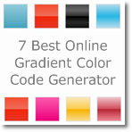
7 best Online CSS3 Gradient color code generator
ColorzillaVery powerful Photoshop like CSS gradient editor and generator with flexible preview panel. Provides features like Cross browser CSS output-Sass output, Horizontal-vertical-diagonal and radial gradients, Hex-rgb-rgba-hsl-hsla color formats, Complex multi stop gradients, Opacity support with multiple opacity stops, More than 135 gradient presets, Adjust gradient by hue-saturation-lightness plus lots more functions.
Colorzilla is pretty complicated gradient color editor, but it is very enrich than other, unlimited possibility that anyone can ever imagine of.
CSS3 Factory
This gradient color generator is very easy to use and output is also neat. This tool has 2 type color format output CSS3 prefix webkit, Gradient Direction (X – Start, Y – Start, X – End, Y – End), multiple gradients and color adding presents. Easy to use and time saver
CSS Matic
The ultimate CSS tools for web designers. This tool offers 25 gradient presets, reverse colors and multi stop gradients, Opacity support with multiple opacity stops, Hue-Saturation-Lightness adjustment, Cross browser supports output, CSS and SASS outputs import from CSS plus more functions.
Angry tools
Easy online CSS Gradient Generator. 45 gradient presets, 5 types of output, various orientations
including linear or radial, rotation option, Locations, reverse colors, Opacity supports, Cross browser capability output.
Microsoft CSS Gradient Background Maker
Uses color picker and live demo to create CSS background image gradients. Output CSS3 markup has Cross browser supports output of (prefixes: -ms-, -moz-, -o-, -webkit-), 3 type gradient style: Linear-Circular-Elliptical, Start and end locations, Offset, Direction (to bottom right, to bottom, to bottom left, to right, to left, to top right, to top, to top left)
CSS3 Gradient Generator
Simple CSS3 gradient generator which makes life easy. Start and end locations, rotation option, RGB output, Cross browser capability output.
Free HTML5 templates
Quick 2 Color CSS3 Gradient Generator. Beginning color and ending color, specify a third-middle color, Direction supports (Top to Bottom, Left to Right, Radial), supports output of (prefixes: -moz, -webkit-).
- And all these CSS3 tools listed here in this article (link) offer's simple and easy Gradient Color generator.
Gradients background gives your site a very stunning look. For website’s background necessary gradients background generally served by photoshoped image what makes you site loading speed bit of sloppy so use CSS Gradients editor and generator to produce your Gradient background save your times, get smarter and explore cooler outlook from the world of colors. What tool you use or will be use don’t forget to mention.


